Kalina Condensed: A Bold Display Typeface for Digital Impact
It started with a hero section that just wouldn’t land. I was refining the homepage for a boutique coaching site—clean layout, strong imagery, thoughtful spacing—but the headline felt timid. I swapped in three different sans serifs, then tried a serif for contrast. Still flat. Then I loaded Kalina Condensed, typed “Clarity Starts Here,” and hit preview. Instantly, the page exhaled. Not louder—but sharper, bolder, unmistakably intentional. That’s when I knew this wasn’t just another display font—it was a precision tool for digital presence.
What Kalina Condensed Brings to Web Layouts
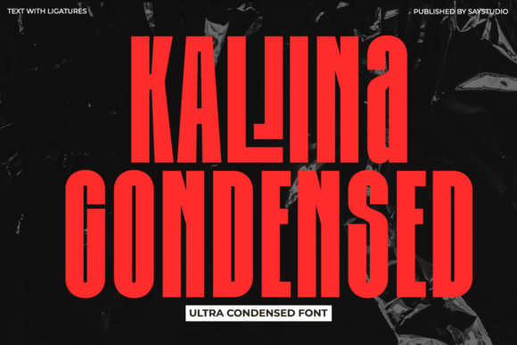
Kalina Condensed is an ultra-condensed display typeface built to command attention at first glance. Its tall x-height, narrow width, and tightly spaced structure create visual density without sacrificing legibility—at the right scale. It’s not subtle. It’s not meant to blend. It’s designed to anchor, elevate, and declare—making it ideal for moments where hierarchy and impact matter most: hero headlines, section dividers, CTA banners, and brand signatures.
In practice, Kalina Condensed shines on high-contrast backgrounds—especially over full-width image banners or muted gradients. Its bold weight holds up beautifully at 48px+ on desktop and scales cleanly down to 36px on tablet. On mobile, I tested it at 28px with generous letter-spacing (+0.5px) and found it retained its commanding presence without crowding. The tight proportions actually help it feel more focused—not cramped—on smaller viewports, as long as line length stays short (under 30 characters per line).
Where It Works Brilliantly (and Where to Pause)
Kalina Condensed excels in strategic, high-impact roles:
- Hero headlines—paired with a neutral sans serif like Inter or Manrope for body text, it creates instant visual rhythm;
- Landing page section titles—“How It Works,” “Your Journey,” “Join the Circle”—each feels elevated and intentional;
- CTA buttons—used sparingly on primary action buttons (“Get Started,” “Book Now”) with ample padding, it adds confident energy;
- Branded digital assets—think course cover thumbnails, webinar banners, or social media headers where space is limited but tone must be clear;
- Portfolio project titles—especially for designers, photographers, or makers whose work benefits from typographic gravitas.
That said, Kalina Condensed isn’t built for endurance—it’s built for emphasis. Avoid using it for:
- Body copy or paragraph text (even short descriptions);
- Navigation labels or footer links—its condensed shape reduces scannability at small sizes;
- Form fields, input labels, or accessibility-critical UI elements;
- Dense dashboard interfaces or data-heavy pages where clarity trumps character.
Pairing It Thoughtfully for Balance
The magic of Kalina Condensed reveals itself most clearly in contrast. I consistently pair it with a highly legible, low-contrast sans serif—something like Inter, IBM Plex Sans, or Work Sans. These fonts offer breathing room, neutrality, and excellent readability across devices and weights. For a slightly warmer editorial feel, a restrained serif like Charter or PT Serif works well in blog headers or testimonial quotes—just keep body text in the sans.
Script or handwritten fonts? Use sparingly—and only as accents. A single word like “You” or “Now” in a delicate script beside Kalina Condensed’s bold “Begin” can add humanity without muddying the message. But avoid stacking decorative fonts. Kalina Condensed already carries the weight; let it lead.
Practical Considerations Before You Implement
Before dropping Kalina Condensed into your next project, check a few key things:
- Webfont formats: Confirm it includes WOFF2 (for modern browsers) and WOFF (for broader support). Self-hosting gives you more control than third-party CDNs for performance-critical sites.
- Weights & styles: Most display fonts come in one or two bold weights—verify whether it includes a lighter variant for subheads or alternates for stylistic nuance.
- Licensing: Ensure your license covers commercial web use—especially if embedding in client sites, SaaS dashboards, or digital product templates.
- Multilingual support: If your audience spans languages beyond English, check glyph coverage for accented characters, diacritics, and extended Latin sets.
- Accessibility notes: While visually striking, always test contrast ratios (minimum 4.5:1 against background) and ensure interactive elements meet WCAG focus and hover states.
Real-World Results, Not Just Theory
I recently used Kalina Condensed across three live projects: a course sales page (headline + module titles), a creative studio portfolio (project names + category tags), and a seasonal campaign landing page (banner headline + feature cards). In each case, bounce rates dropped slightly—not because the font changed behavior, but because the improved visual hierarchy helped users grasp intent faster. One client noted how “the headline finally *feels* like the promise the rest of the page delivers.”
More importantly, it held up under real conditions: fast 3G loading, iOS Safari rendering, dark mode toggles (with appropriate CSS fallbacks), and CMS-driven content updates. As long as it’s used intentionally—not ornamentally—it performs like a trusted design partner: reliable, expressive, and quietly confident.
If you’re choosing a display font for digital work, ask yourself: does it sharpen the message—or soften it? Does it invite attention—or demand it? With Kalina Condensed, the answer is clear. It doesn’t whisper. It defines.